BBC WORLD –
Rebrand Concepts
In early 2016, I was invited to lead creative development on a rebrand pitch for BBC World, the flagship natural world documentary series. While the project was ultimately cancelled just as production began, the conceptual work explored three distinct directions — each rooted in the BBC’s identity while offering a refreshed take on its legacy.

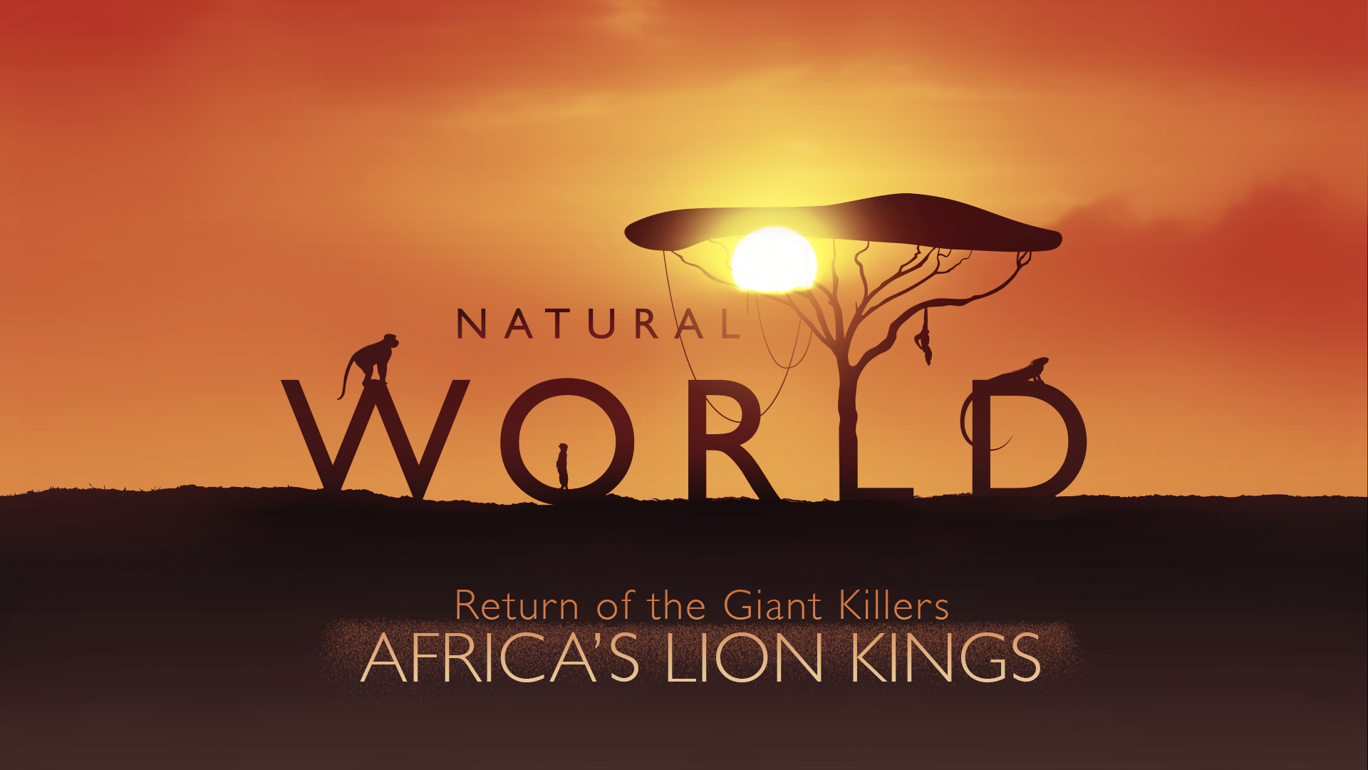
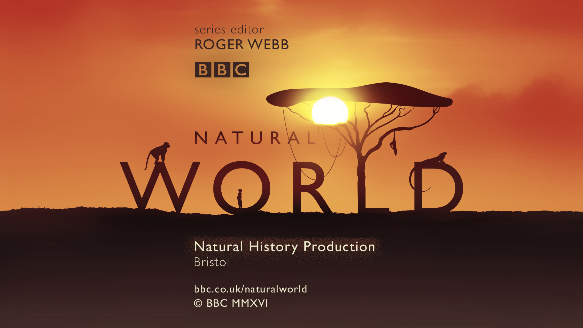


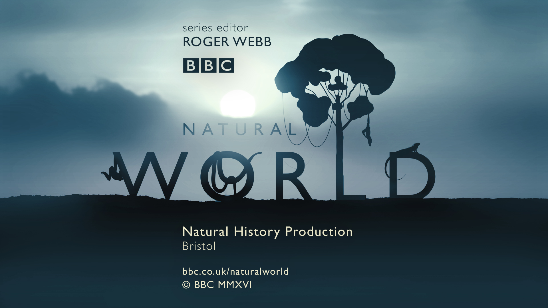
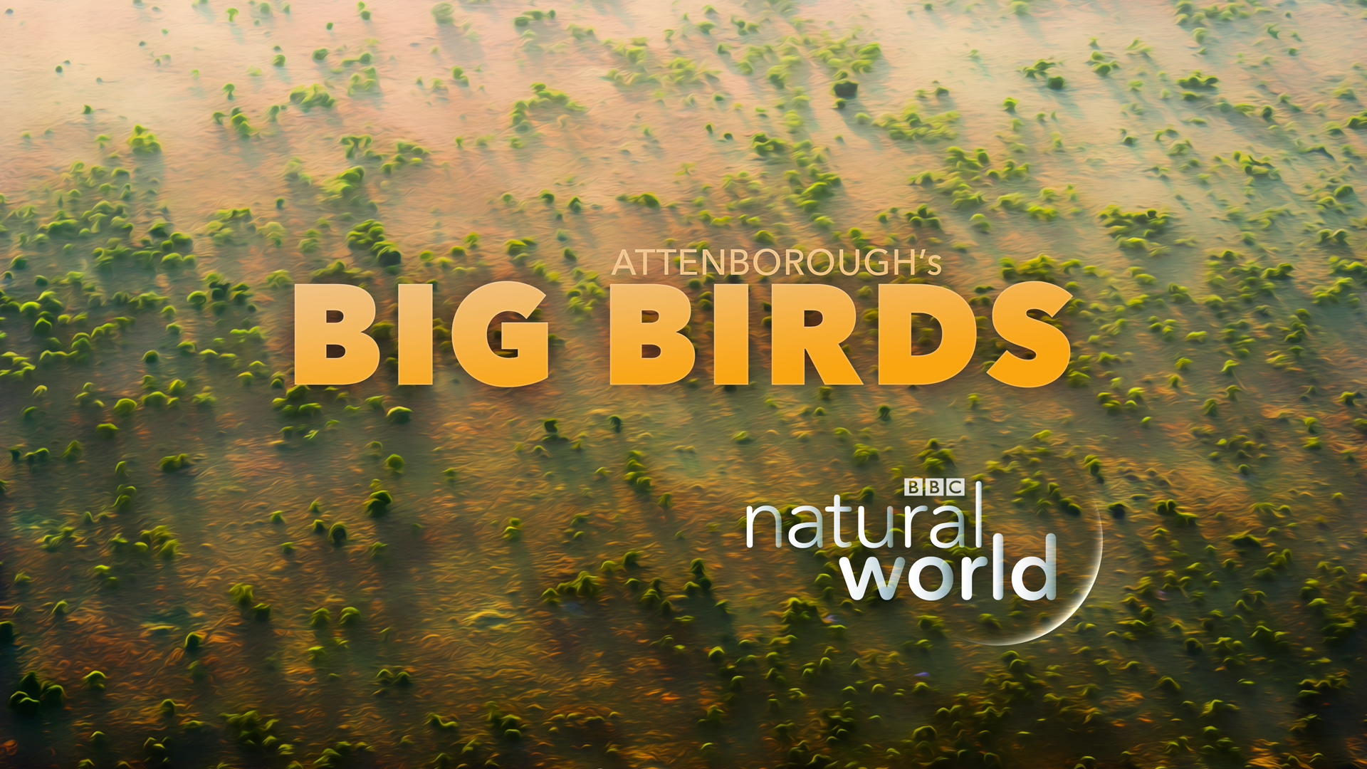
Theme 1: Microcosm
The selected concept, Microcosm, reimagined the BBC logo as a living habitat — a dynamic ecosystem where wildlife, climate, and terrain orbit around the iconic Gill Sans letterforms. The idea was to create a modular system that could flex across episodes and environments, while remaining instantly recognisable as part of the BBC family. This identity was intended to sit within the programme itself, rather than operate as a standalone top-and-tail.

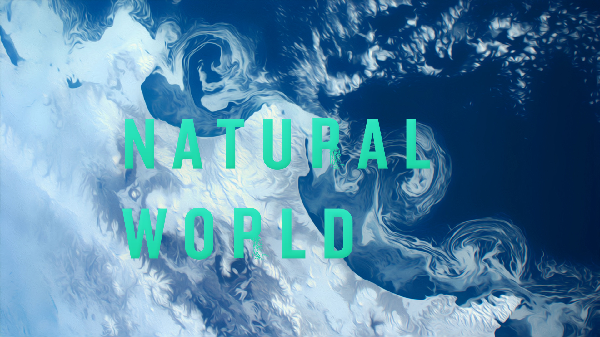
Theme 2: Organism
An alternate route explored the organic structures and behaviours of biological systems. The identity evolved in fluid, cellular motion — drawing parallels between visual patterning in nature and networked information.
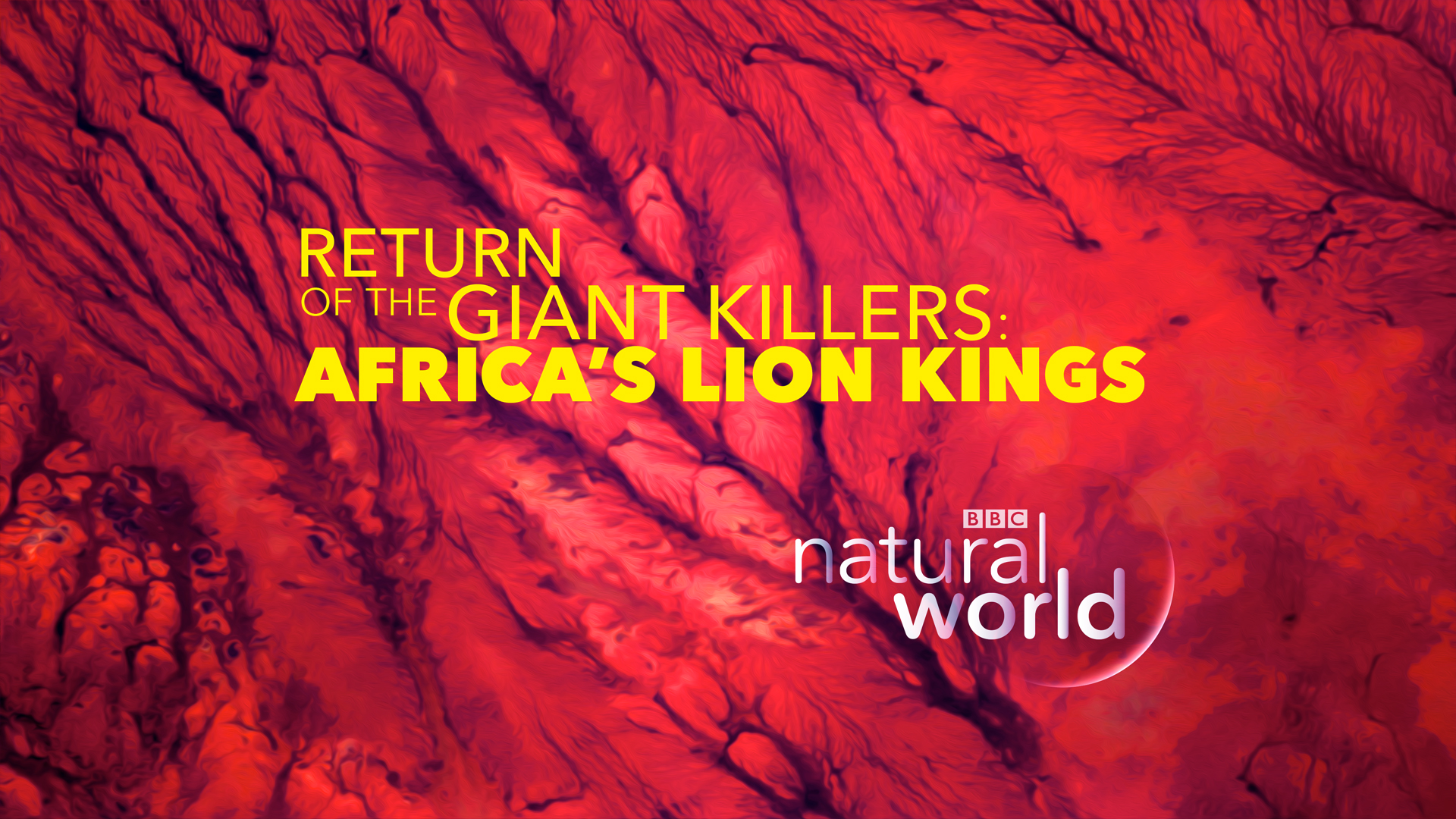
Theme 3: Spectrum
Inspired by The World About Us — the BBC’s pioneering colour documentary series — Spectrum paid tribute to the broadcaster’s early use of colour television. Here, abstract colour compositions served as a vivid counterpoint to the natural realism of the programme footage. The logo remained minimalist and calm, floating against bold, expressive backdrops. This system was built as a modular open and close, designed for customisation per episode.
Each direction balanced clarity with flexibility, aiming to reassert BBC World as a thoughtful, trusted, and contemporary voice in natural history storytelling.
Let’s Work Together.
Reach out—I'm always excited about new creative conversations.
+44 7983 477 737
contact@nilskloth.com